Sector: Retail, Cannabis Company: 7 Rays Marketing Discipline: Branding and Packaging

A retail-focused cannabis brand aims to stand out in an increasingly sophisticated market.

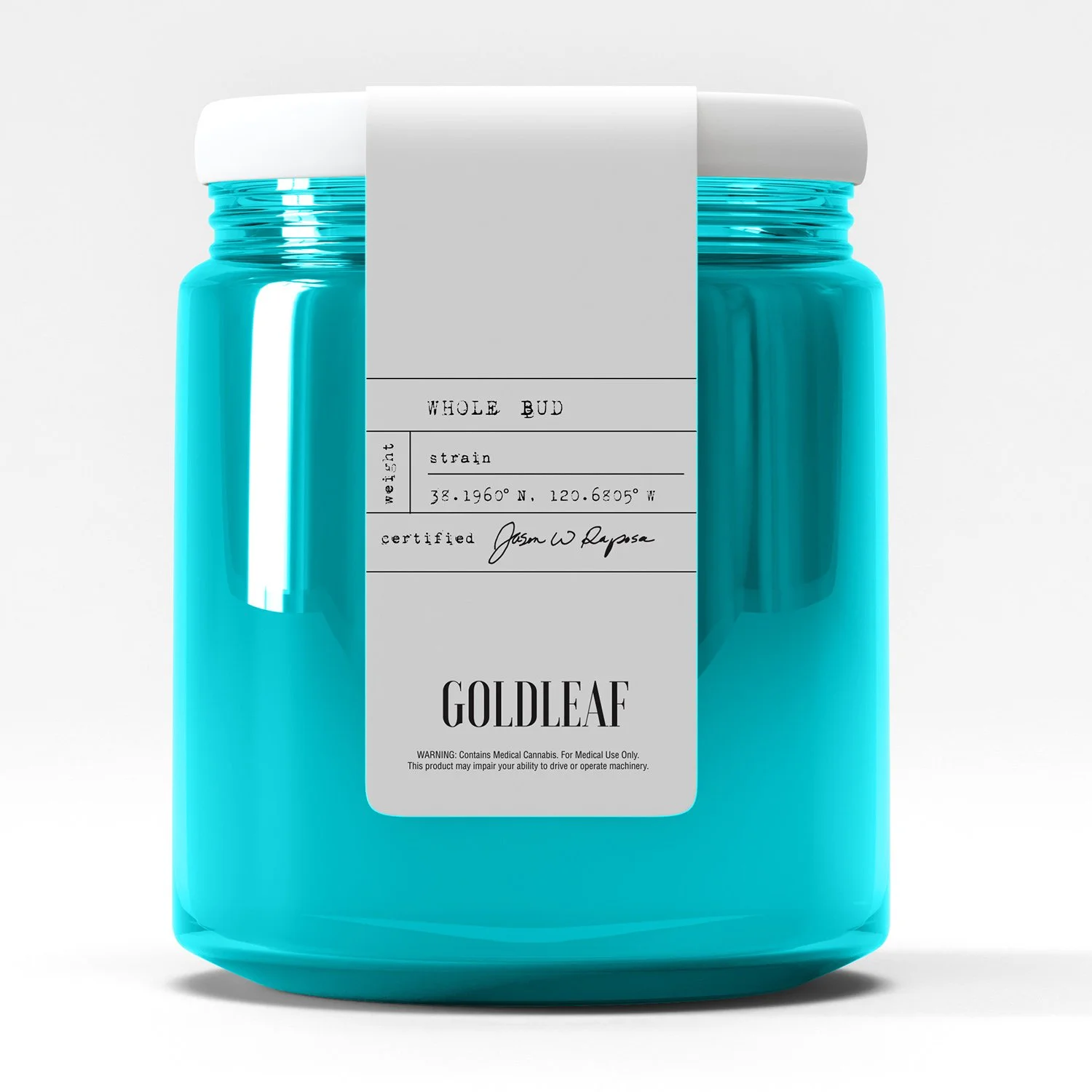
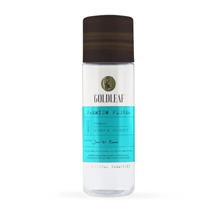
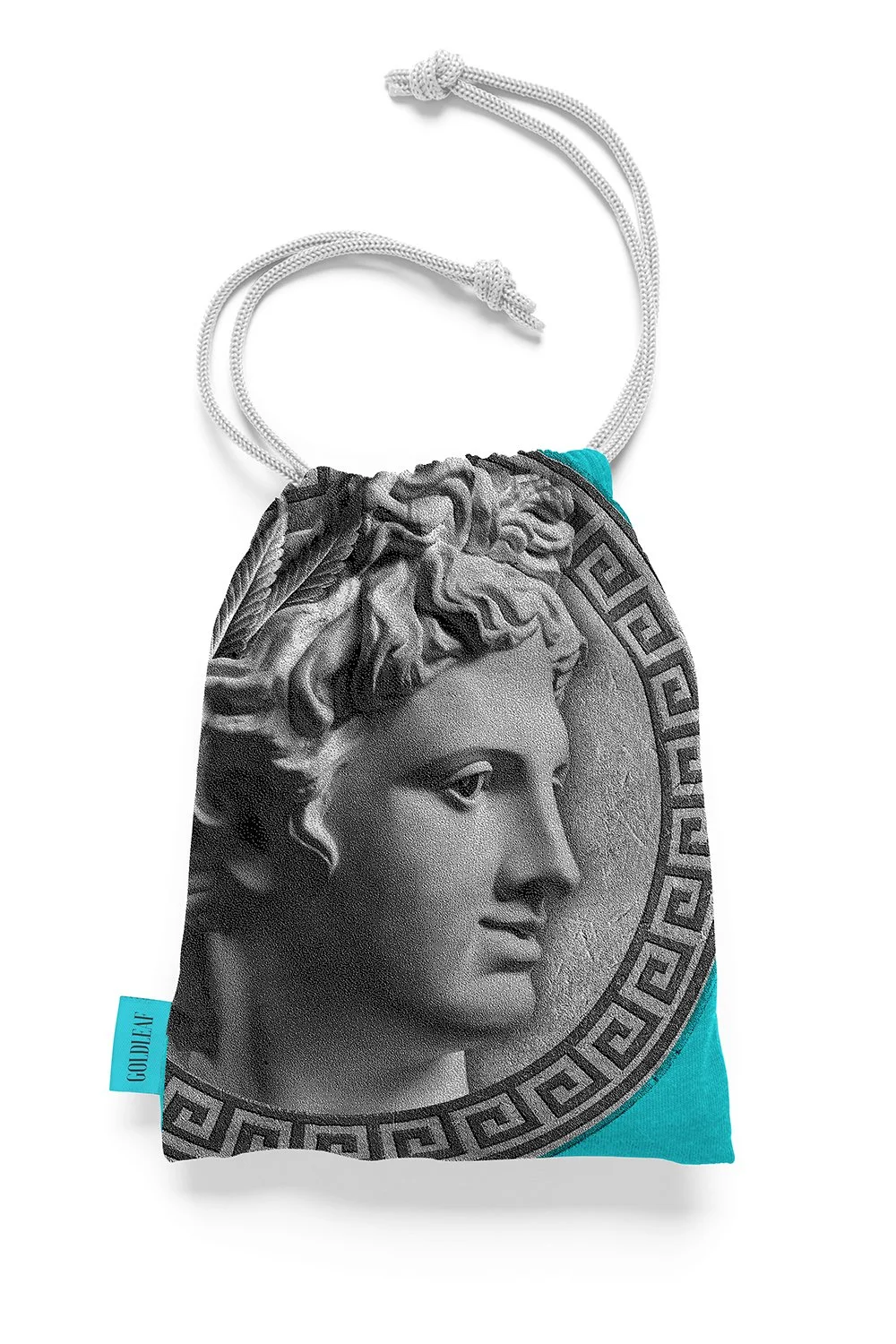
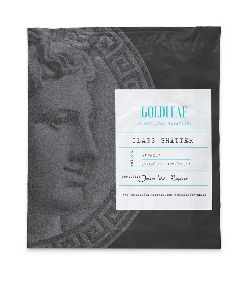
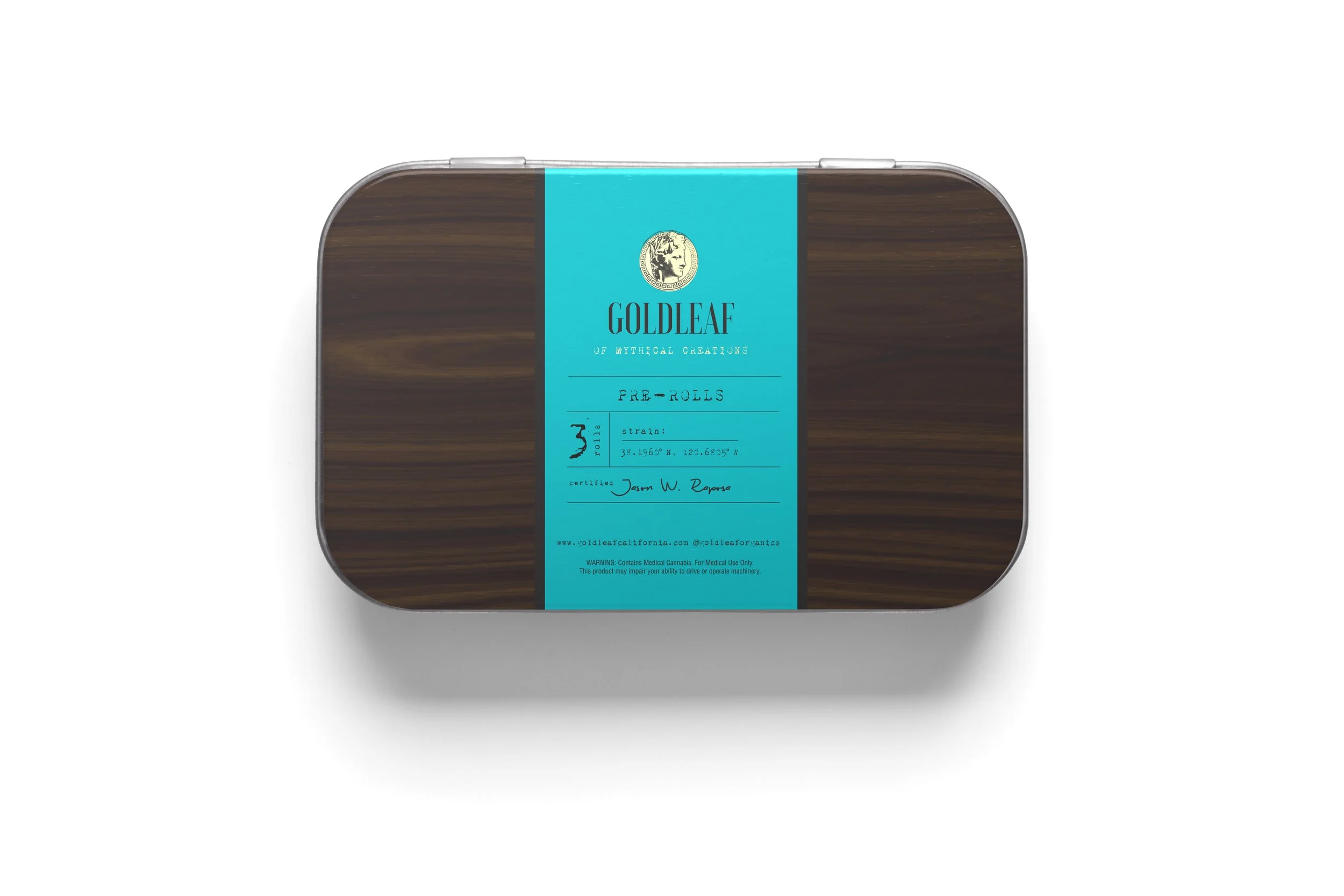
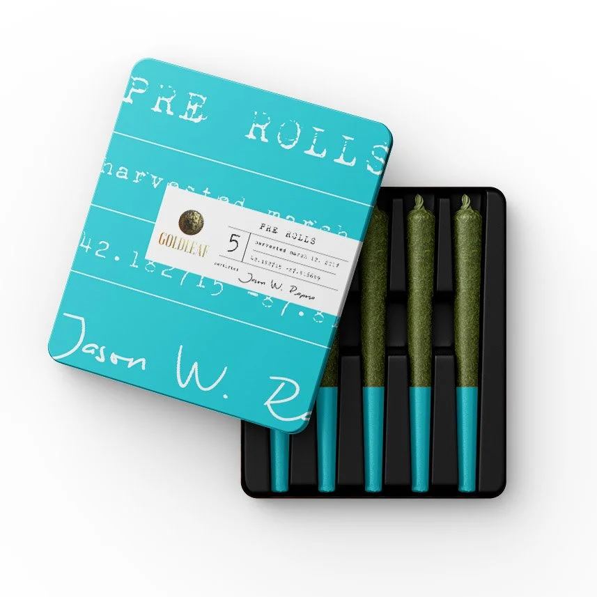
As consumer expectations evolve toward elevated design, storytelling, and experience, the opportunity was to position Goldleaf with a differentiated narrative rooted in meaning and modern relevance with a new brand design and packaging system.

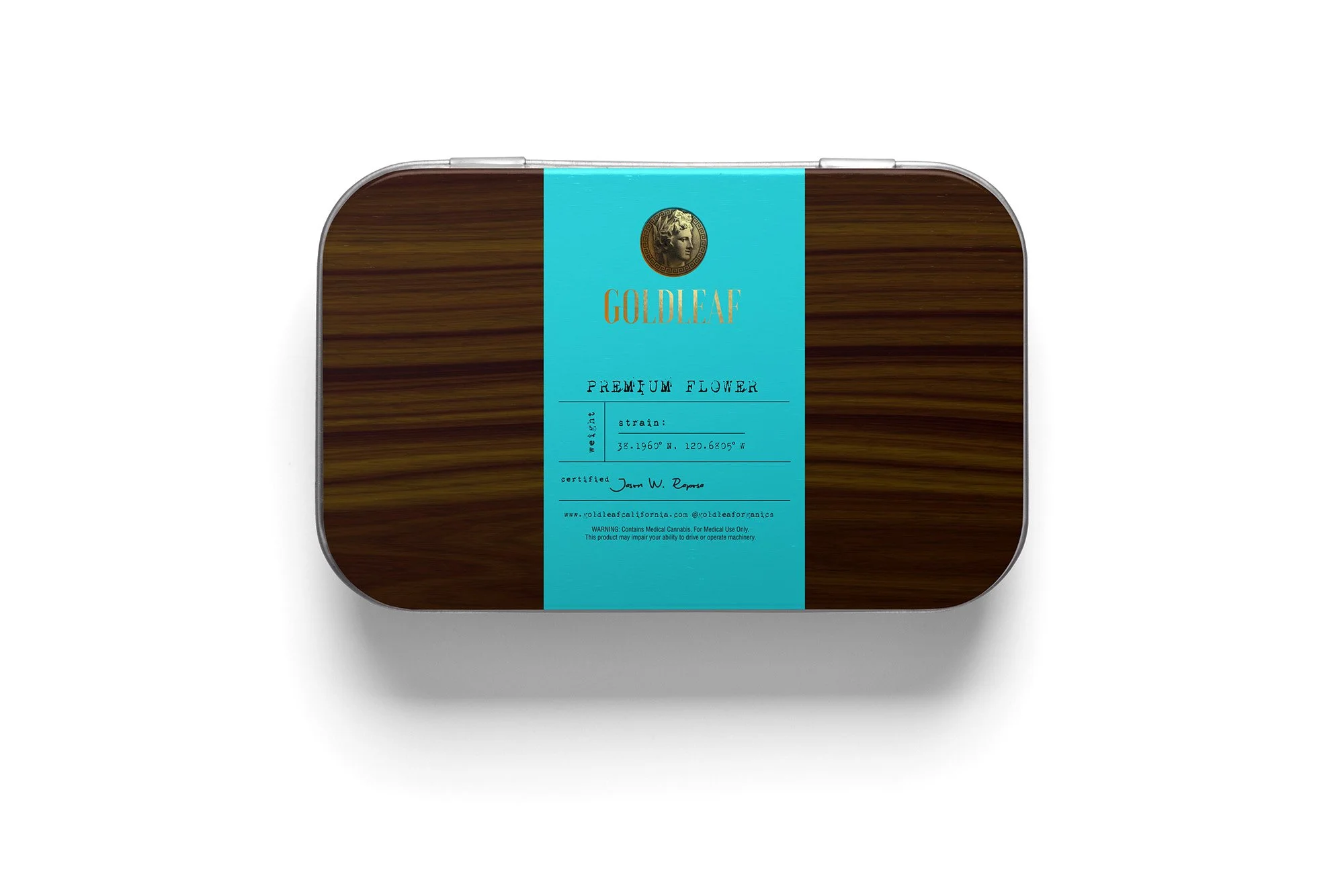
Strategic research and competitive analysis pointed to a powerful platform: reconnecting cannabis to its ancient medicinal and mythological origins.

Building on the existing name, the tagline “Of Mythical Creations,” established a narrative that blends heritage, wellness, and imagination. Apollo—the Greek God of the Sun and the Arts of Healing—became the emblematic anchor for the brand. His portrait, reinterpreted through a modern lens informed the logo designer, and styled after an ancient gold coin. The laurel crown, traditionally worn by Greek deities, was reimagined using cannabis leaves to subtly tie mythology to the product’s botanical roots.

By exploring multiple ideas informed by Greek mythology, cultural symbolism, and audience insights, we arrived at a direction inspired by old apothocaries with a contemporary twist that elevates Goldleaf beyond category norms. The final designs merge historical richness with a sophisticated bent, positioning the brand with a memorable story and premium packaging.

Previous
Previous

Reimagining the Riverfront as a giant city stage

Next
Next

Design Unleashed